Adjust vector symbology
So what do we mean by symbology?
- Symbology
- The way a dataset is visualised or displayed, for example colours, line thicknesses or patterns
Let’s have a go at changing how vector data are symbolised in QGIS. Try adjusting the symbology of your own field data, or work with one of the gibbon datasets
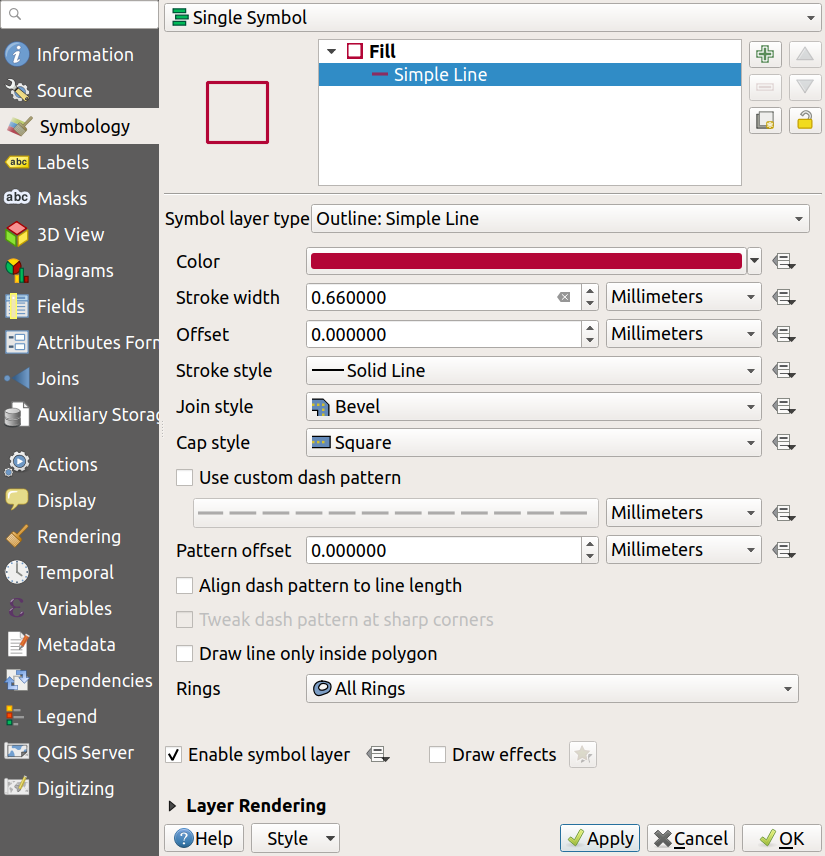
First of all, you need to open the layer’s Symbology tab in Layer Properties:
- Double-click on the layer you want to edit in the
Layers panel, to open the Layer Properties pop-up window- Select
Symbologyfrom the left-hand menu- Continue with the instructions below depending on what type of vector data you’re visualising
Point symbology
- At the top, under where it says ‘Marker’, click on
Simple Marker- Adjust the
SizeandFill color- Click
Applyto see the effect of these settings- Optionally play with some of the other settings to understand what they do
Line symbology
- At the top, under where it says ‘Fill’, click on
Simple Line- Adjust the
Color- Click
Applyto see the effect of these settings- Adjust
Stroke widthandStroke styleto see some of the other effects you can create
Polygon symbology
- At the top, under where it says ‘Fill’, click on
Simple Fill- Click on the
Symbol layer typedropdown just below and selectOutline: Simple Line- Click
Applyto see the effect - your polygons should now be drawn as an outline only, with no fill colour- Switch the
Symbol layer typeback toSimple Fill- Try adjusting the
Color,Stroke widthandStroke styleto see the effect of these settings

Previous submodule:
Resolution & extent
Next submodule:
Uncertainty